Why does black instantly make us more magnetic? Why does blue convey calm? And why, on our best days, do we instinctively choose brighter colors?
It’s not just a matter of taste. The meaning of colors in fashion stems from light, perception, and memory—but also from culture, instinct, and desire.
Visible light comprises different wavelengths: those of red are longer than those of blue. When light reaches the retina, it is converted into signals that the brain processes, giving rise to the perception of color. Experiences, associations, and emotions contribute to the meaning we attribute to it.
That's why we don't just see a color. We feel it.
Some shades glide across the skin with the crystalline precision of a Mozart piece: harmonious, luminous, perfectly balanced. Others take center stage like a song by The Doors: deep, sensual, slightly dark.
Some caress. Others affirm. Still others seduce.
We never wear a color completely at random. We choose whatever seems to resonate with us at that moment.
Color psychology studies how colors can influence attention, perception, and emotional state. These reactions, however, are not universal: they depend on personal experiences, culture, and context.
Red can convey energy and desire. Blue can suggest calm and reliability. Yellow evokes light, vitality, and openness.
Furthermore, in some interpretations of Eastern spiritual traditions, colors are associated with the chakras, which are described in these traditions as energy centers linked to different inner states and intentions. These are symbolic associations, distinct from the scientific explanation of perception.
In this perspective, color is not merely decoration. It is a silent language connecting the body, identity, and consciousness.
Wearing it means choosing how you feel. How you look. How you walk into a room.
The light around us also affects our perception of colors.
Under bright light, vibrant, saturated hues can appear even more vivid, expansive, and dramatic. In softer light, those same hues can appear more subdued and enveloping.
Color interacts with its surroundings. It enhances what is already there, compensates for what is missing, and changes as the day progresses.
That is why a shade never looks exactly the same: it changes on the skin, on fabrics, and in a room.
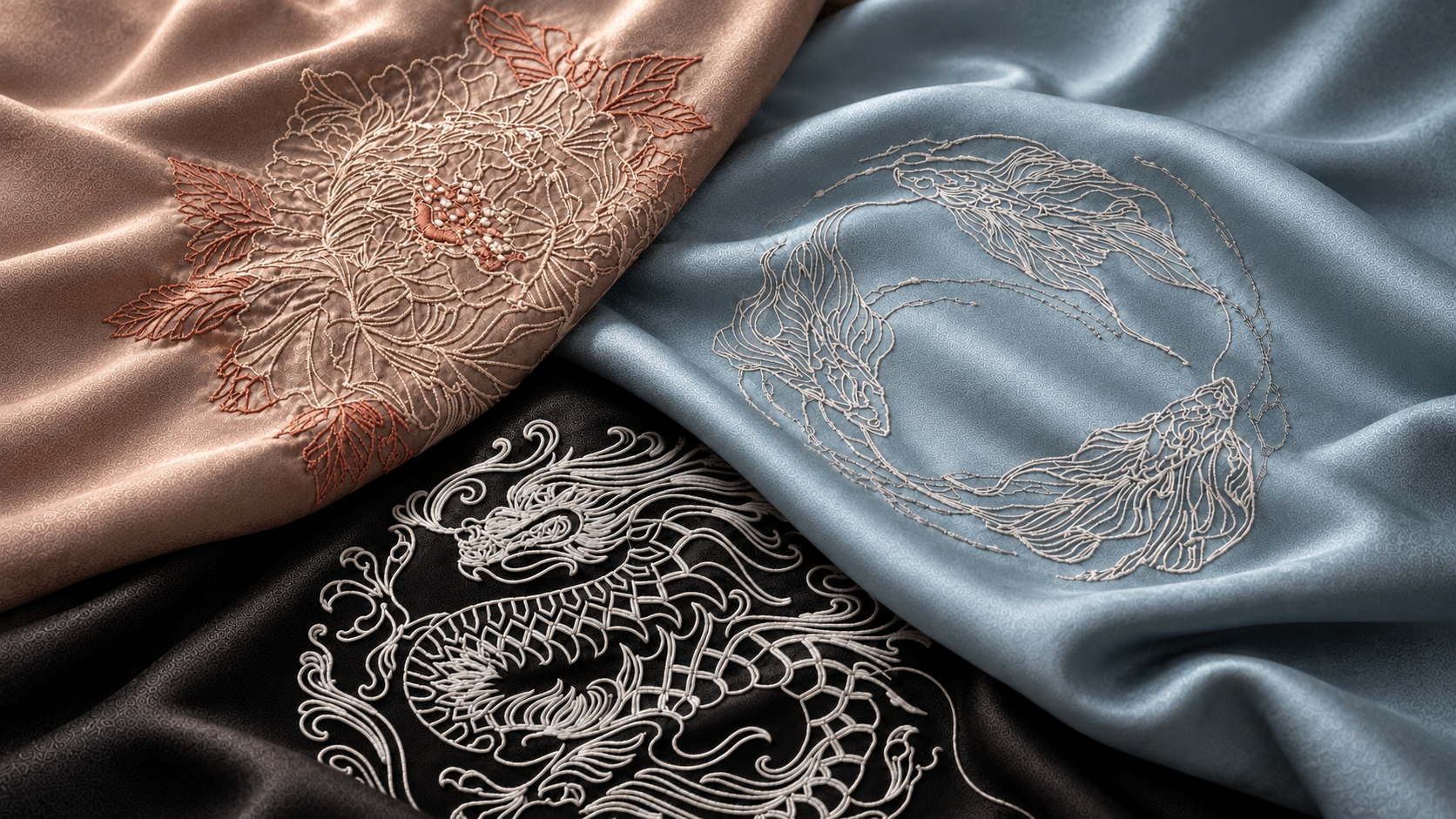
Then there are the soothing colors: sand, terracotta, ochre, olive green, and warm ivory.
These are familiar shades, inspired by the earth and nature. They don’t seek to draw attention—they support it. They don’t excite—they ground.
In clothing and interiors, they can evoke a sense of understated balance. They are perhaps the most subtle form of luxury: the kind that is perceived without needing to be displayed.
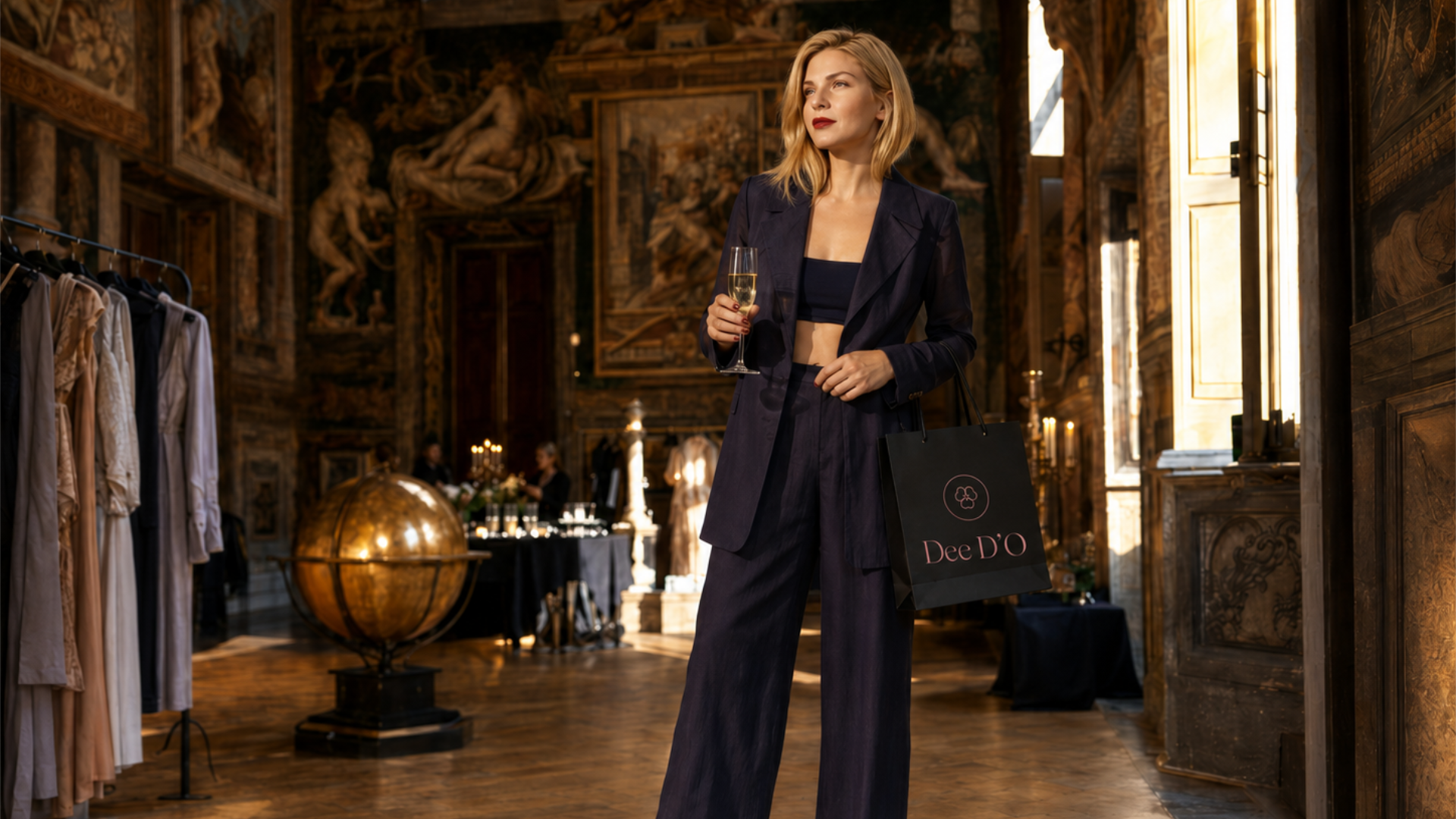
The Dee D’O couture loungewear collection is born at the intersection of aesthetics, perception, and symbolism.
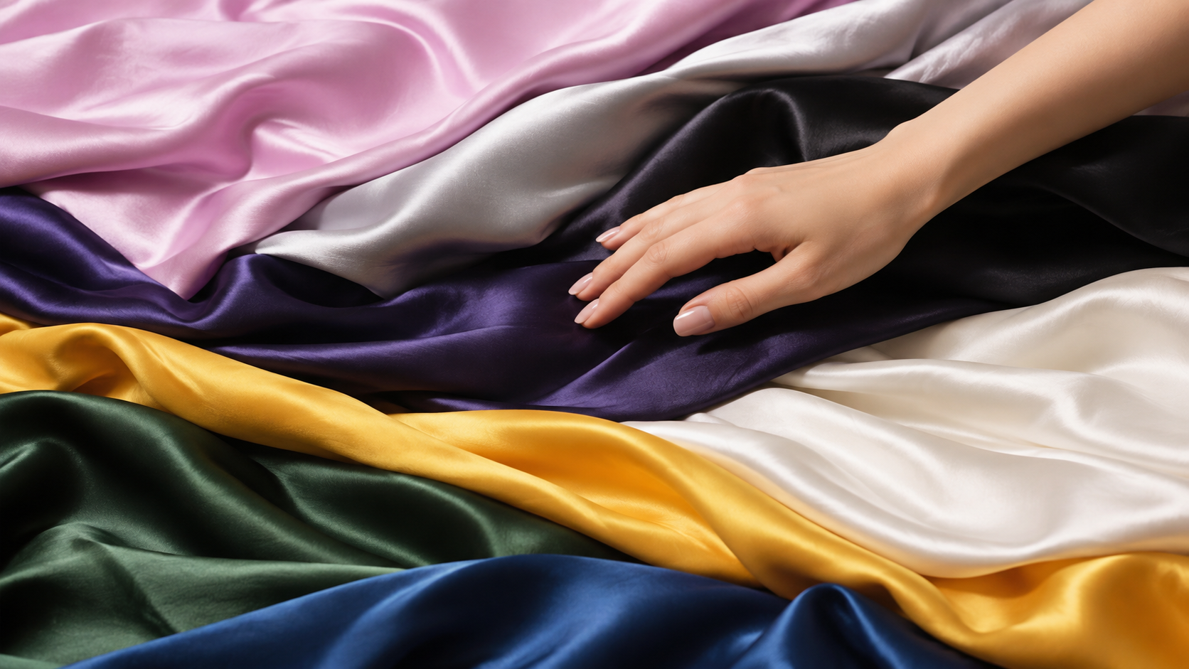
Each shade is chosen to complement the skin, illuminate the face, and enhance one’s presence. Color thus becomes an extension of the body, capable of transforming a silhouette and telling a story even before a word is spoken.
Wearing a Dee D’O color is like walking to the rhythm of a soundtrack: every step creates an atmosphere, every movement changes the light, and every glance captures a different nuance.
It's not just what you see.
That's what's left.
.jpg)
Energy with a touch of elegance. It’s the color red that has mastered self-control: vibrant, open, irresistibly contemporary.
It's not just sweetness. It's emotional security.

.jpeg)
It absorbs light and radiates power. Black represents depth, mystery, and precision.
It doesn't ask for attention. It captures it.
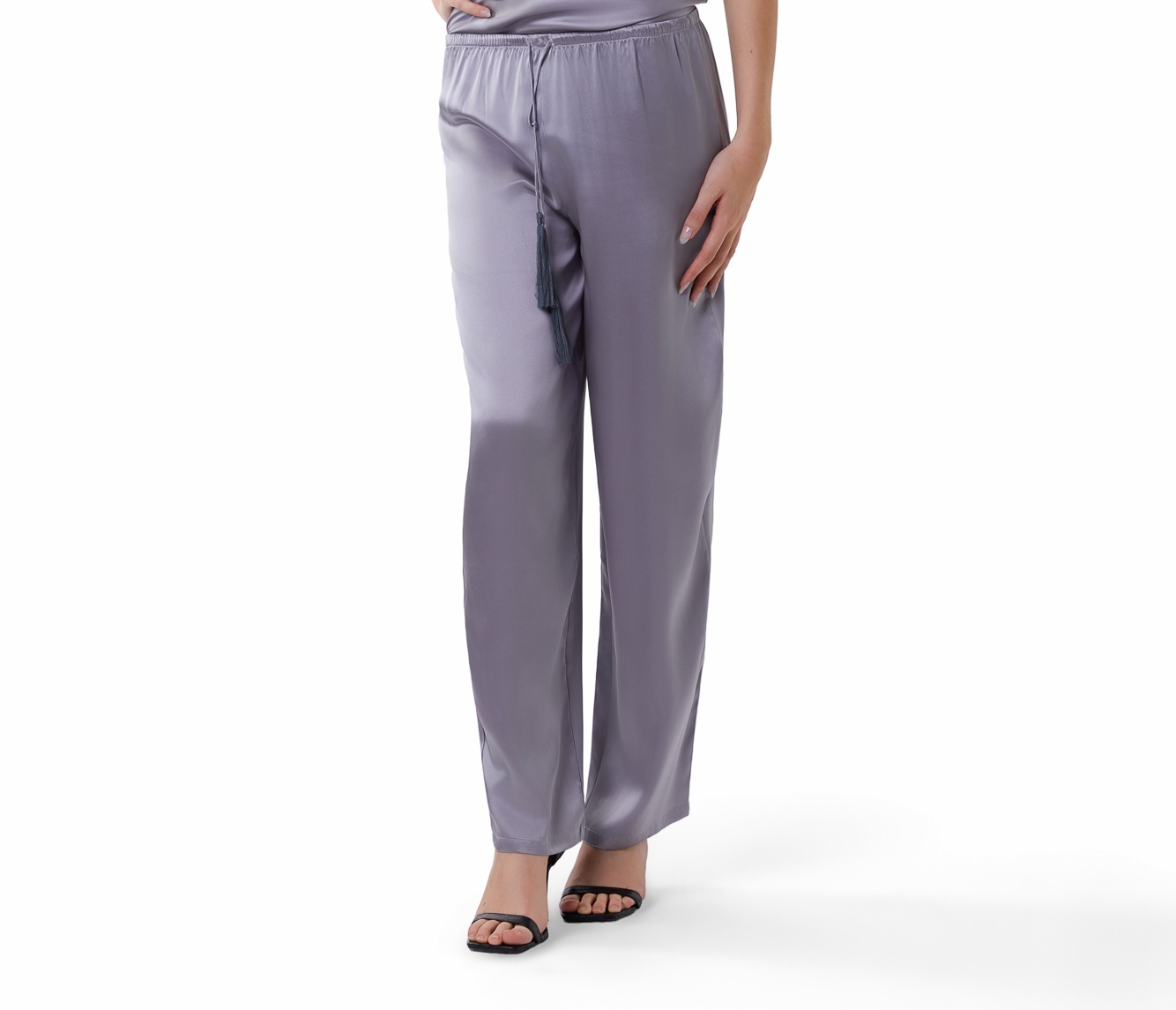
Bright, fluid, sophisticated. Pearl gray is not the absence of color, but balance.
It reflects without revealing itself; it protects without closing off. It is a silence that knows how to make itself noticed.
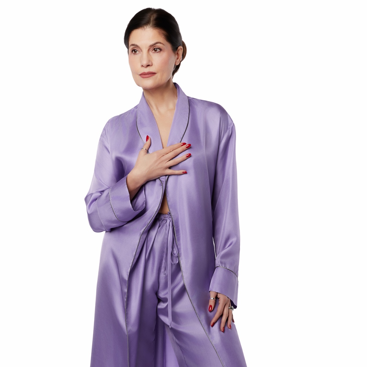
Rich, elegant, introspective. Indigo straddles the line between blue and purple, between calm and intuition.
It is the color of those who observe, understand, and transform.
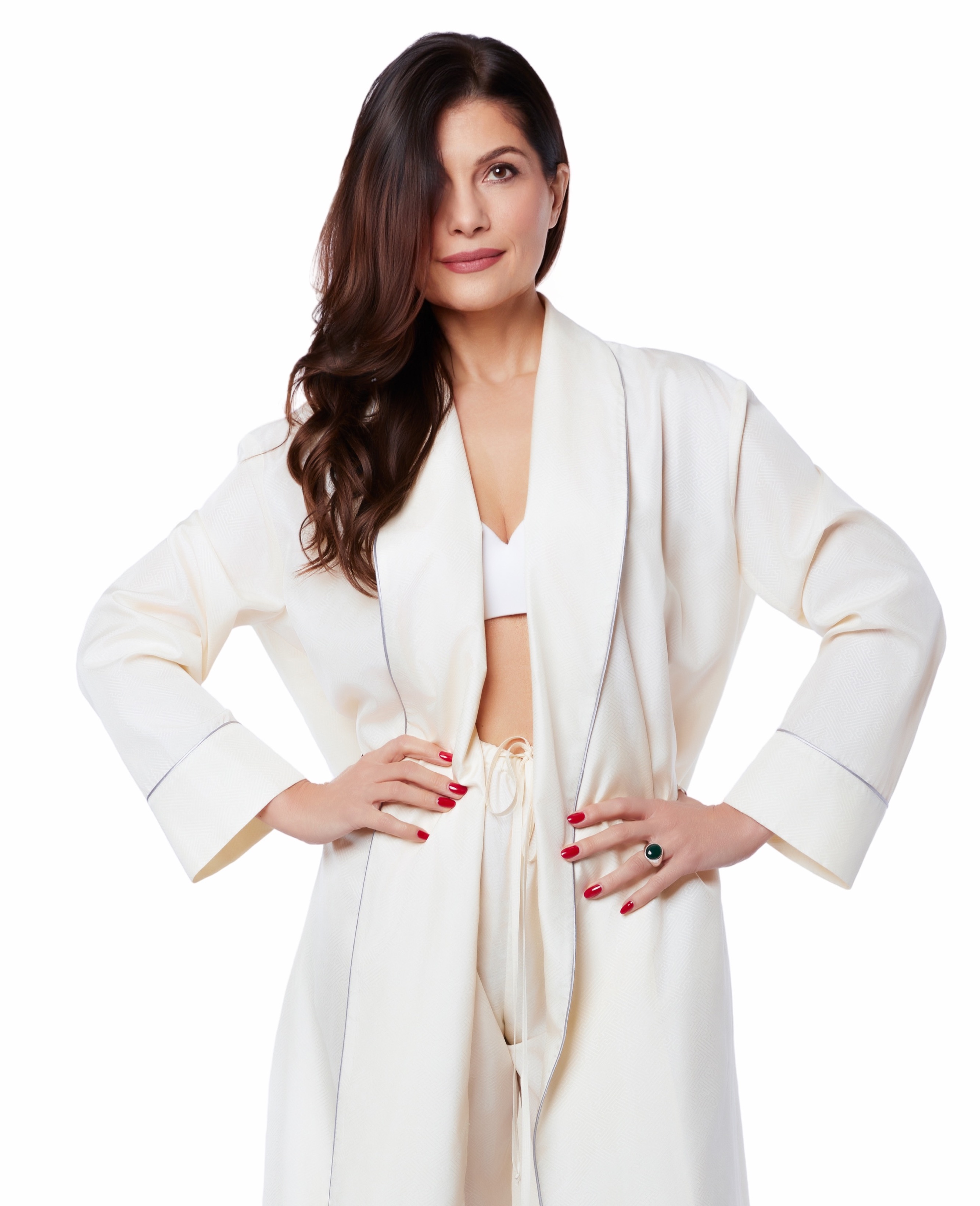
Soft light on the skin. Ivory brightens, opens up, and refines.
It is elegance without formality. Luxury without ostentation.
.jpeg)
Radiant, precise, vibrant. Yellow brightens the space and infuses it with energy.
It is a presence that expands naturally.
.jpeg)
Balance, nature, regeneration. The color green evokes harmony and stability.
It's the feeling of being exactly where you belong.
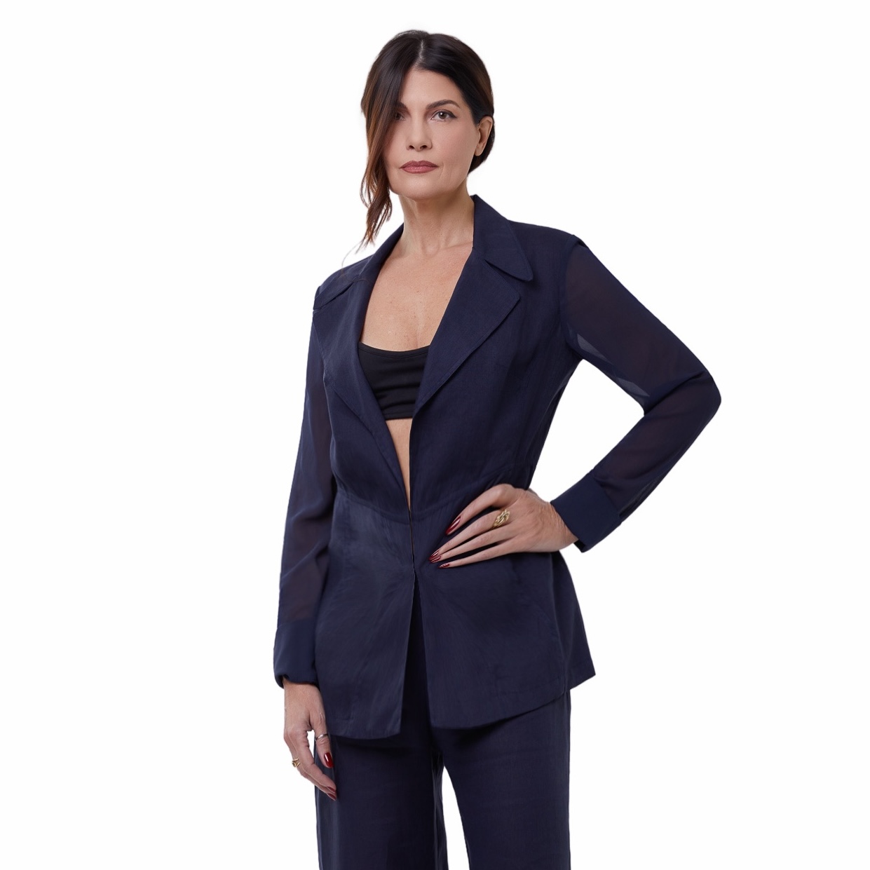
Deep, fluid, continuous. Blue can evoke a sense of calm and be alluring at the same time.
It’s control without rigidity. Power without noise.
A color is never just a color.
It’s a code. A signal. A way of occupying space. It’s what we communicate even before we speak—and what we sense, often without realizing it.
Choosing what to wear also means choosing which part of ourselves to reveal.
And you—what color do you want to be today? Explore the Dee D’O collection and let yourself be guided by the shades that resonate most with you.
Be the first to shop our latest releases, designed for comfort, confidence, and individuality.